BLOG
Best paint colors for your condo
Posted February 23, 2022
Whether you’re renovating, doing a makeover, or moving into a new space, choosing a paint color for your condo is one of the most important aspects of your home’s interior design. Choosing the right shade of color is more than just aesthetic. It doesn’t just enhance your space, but it can affect your mood and overall experience. You’ll be surprised at how a fresh coat of paint can transform the ambience of your room from dull to cozy, stylish, and vibrant.
While white is a common color choice, there are other classy and elegant color choices depending on the feel that you’re going for in the different areas of your condo. Need some inspiration? Here are some top color schemes to help you decide:
1. Living Room
The living room is where people converge to bond and have conversations, so you want to convey warmth in this area.
Earthy colors
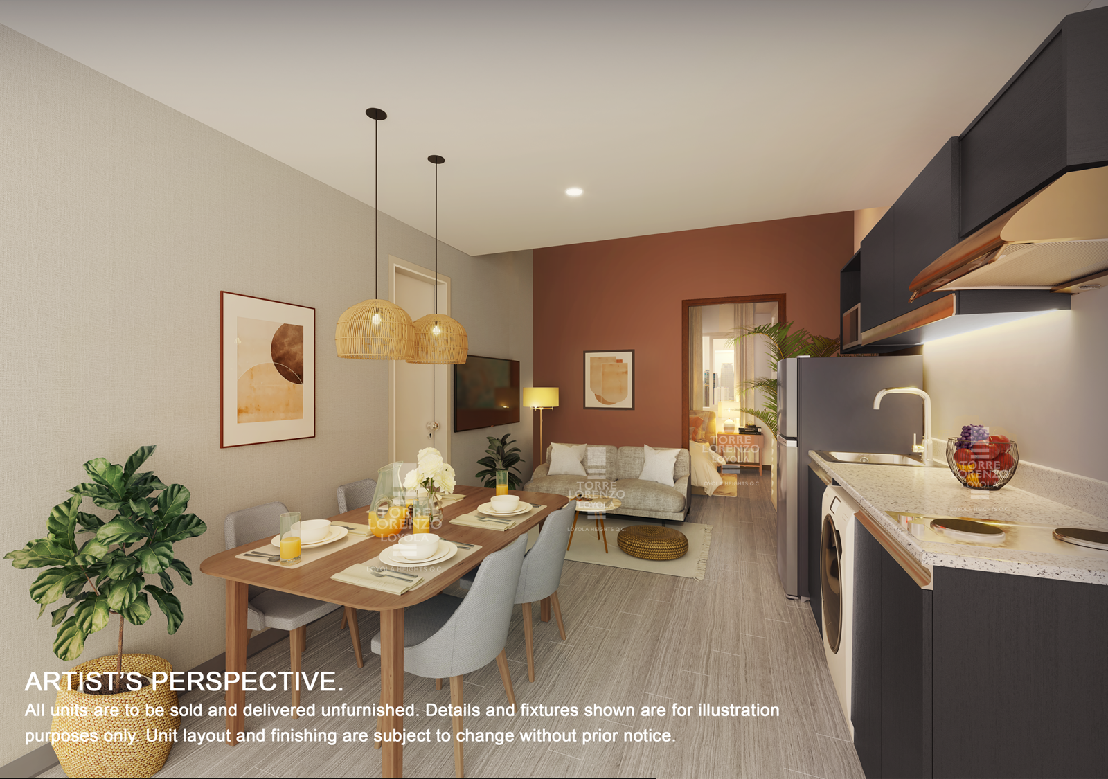 The photo is an artist’s perspective of a one-bedroom unit at Torre Lorenzo Loyola.
Warm tones like neutral brown, earthy ochre, or muted terracotta work best for the living room. These colors are welcoming and stimulate connection.
Yellow
If you want a more cheerful vibe for your living room, a soft shade of yellow is also a good option. It offers a calming, summer atmosphere and makes the room look cozier.
2. Kitchen
For the kitchen, you can base your paint color choice on the existing equipment such as cabinets and countertops. For example, warm tones would complement wood cabinets and shelves.
Light gray
Light gray or pale gray is an ideal color choice if you have white cabinets. It gives the kitchen a light and fresh feel. This is also a good color choice if you have copper or gold metallic accents in your kitchen, such as cabinet handles or faucets.
Cream
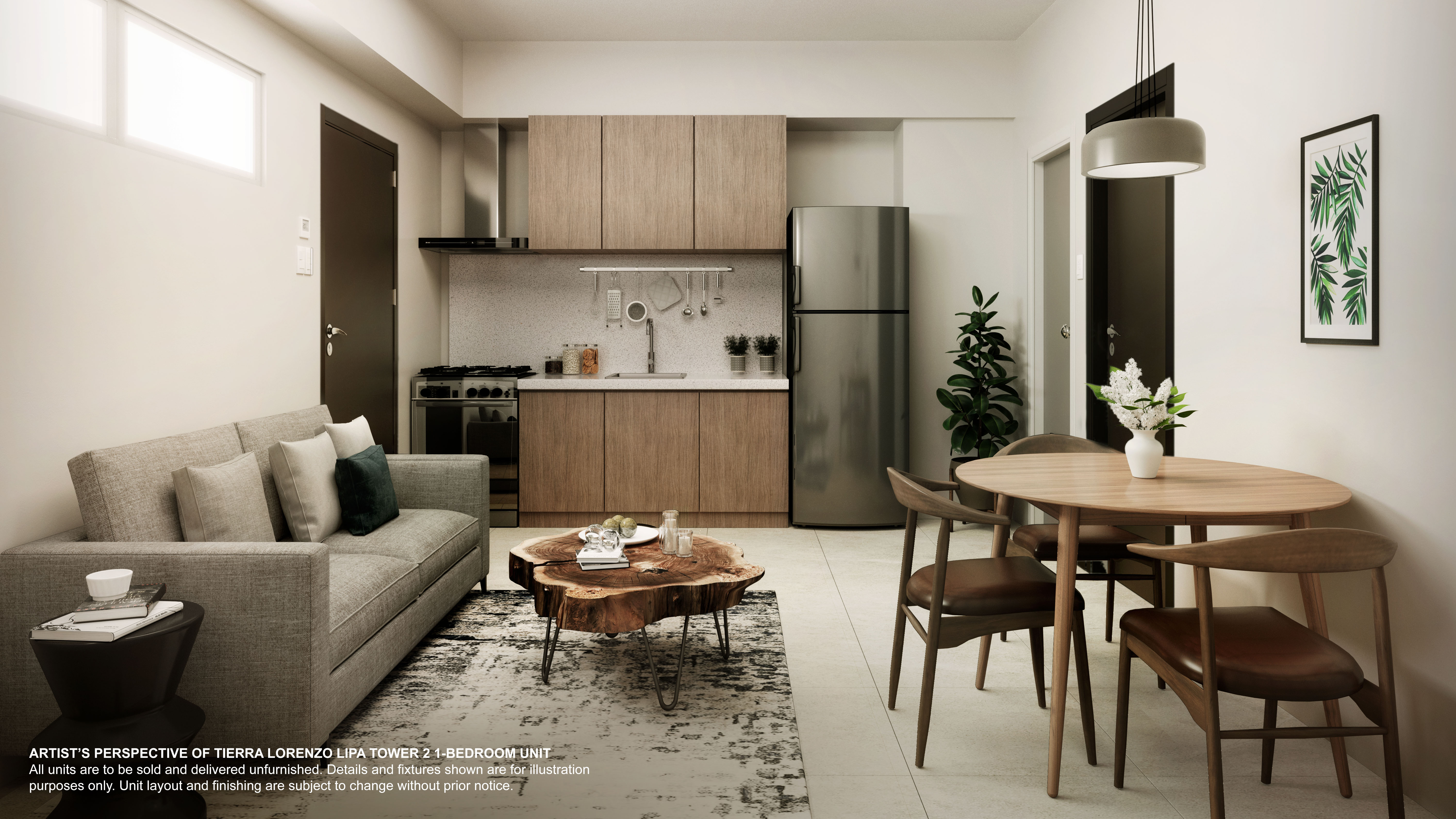 The photo is an artist’s perspective of a one-bedroom unit at Tierra Lorenzo Lipa.
If you want a homey and cozy atmosphere in your kitchen, you will never go with beige or cream colored cabinets. It exudes elegance and complements wood cabinets.
Soft mint
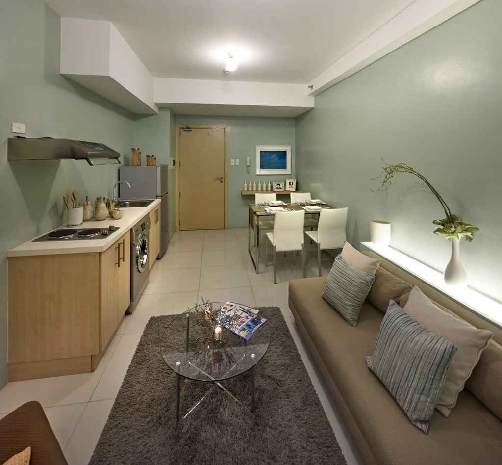
If your kitchen doesn’t have a lot of natural light, a soft mint paint color will open up your kitchen and give it a more airy vibe. It will not only make your kitchen look bigger, but it will also add a feeling of cleanliness.
3. Dining Area
The dining room is often used for gatherings and, therefore, should exude your personality. If you’re the lively host, bright colors will work best for your dining room. If you want a more laid-back ambiance, consider going for light colors.
Bright tones
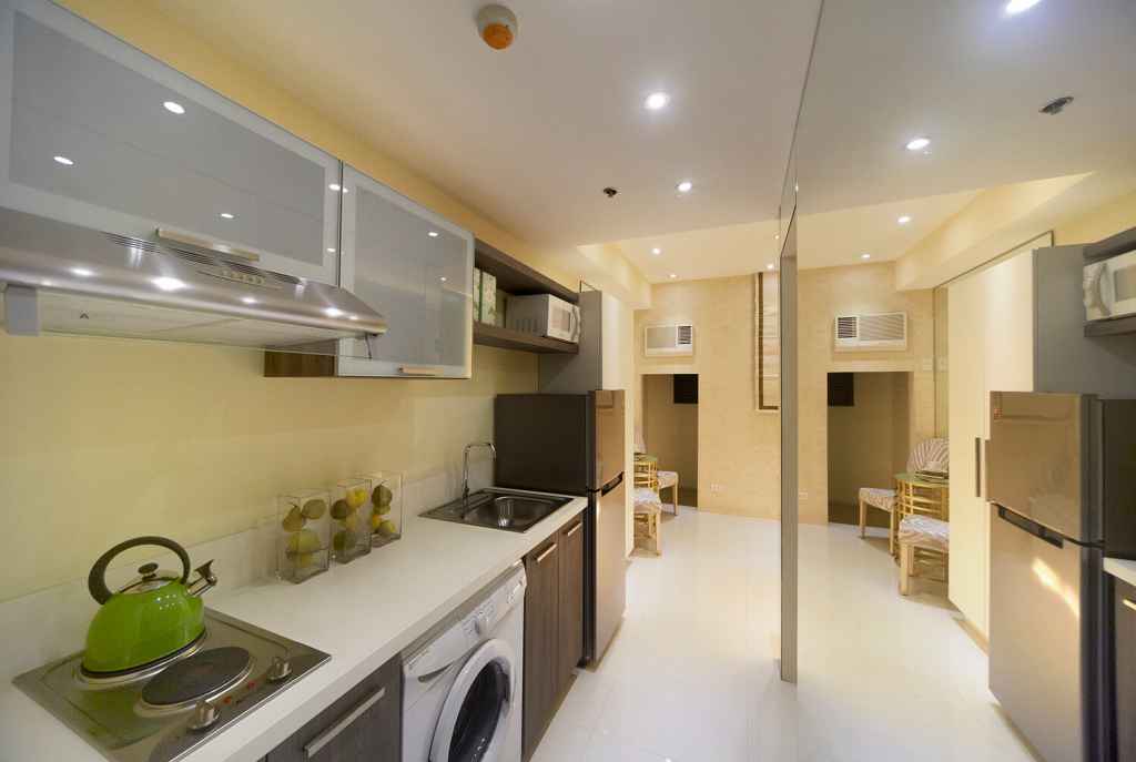 Actual photo of a studio unit at Torre Lorenzo Sur.
A sunny yellow provides an energetic feel and radiates positivity in your dining room. Alternately, choosing shades such as sunset orange or wine red can stimulate connections and appetite and would also work well for a dining room.
Green
Using green in the dining room can bring in energy and warmth to the room. It gives off a sense of freshness and nature. It would be best to complement green paint with fresh plants and flowers to mimic an outdoor dining setting.
Neutral
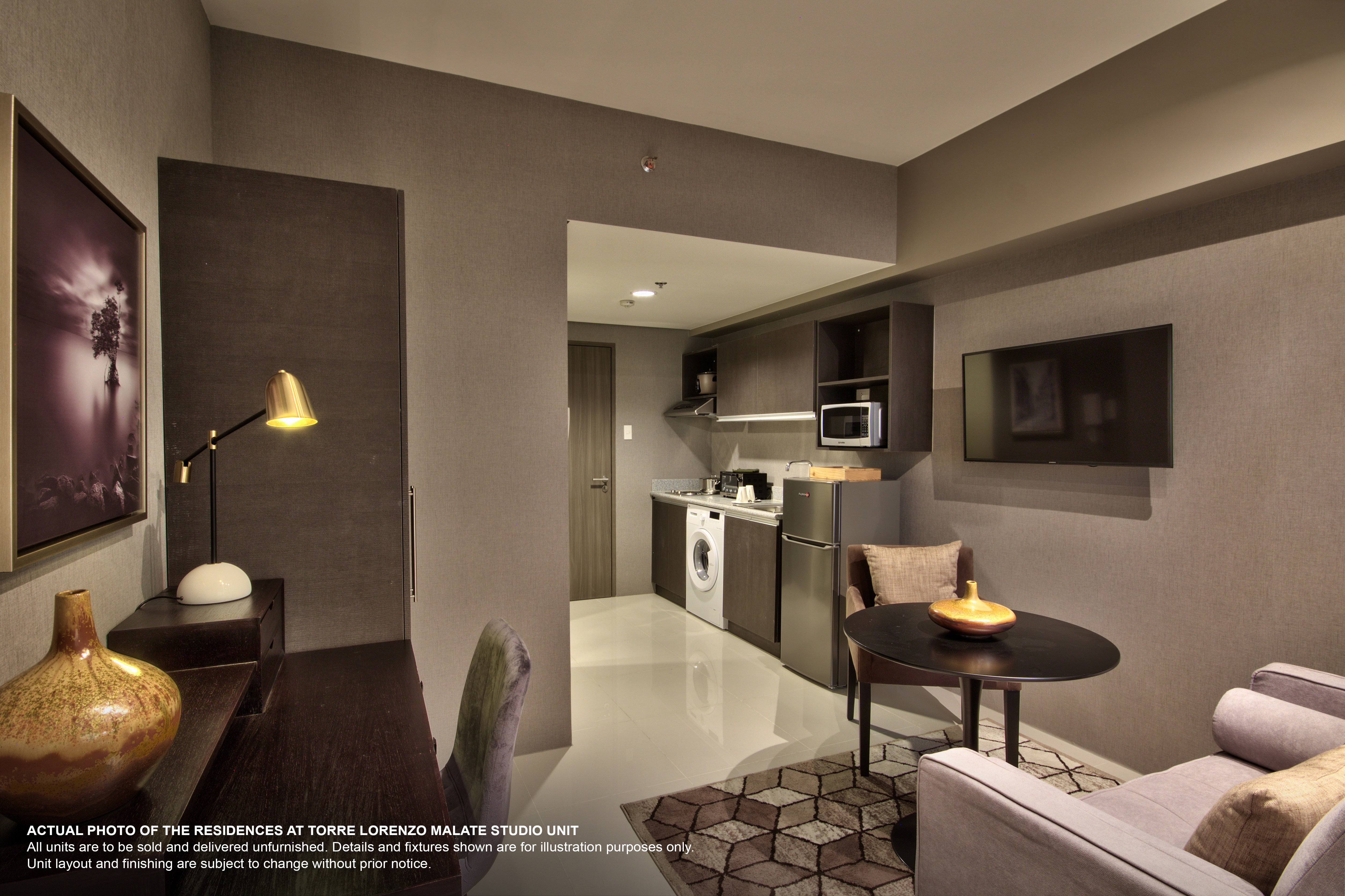 The photo is an artist’s perspective of a studio unit at Torre Lorenzo Malate.
If you want a simple and elegant touch to your dining area, neutrals such as gray or light brown will make your space look more refined. Neutral colors are calming and exude a modern, contemporary feel.
4. Bedroom
Sage green
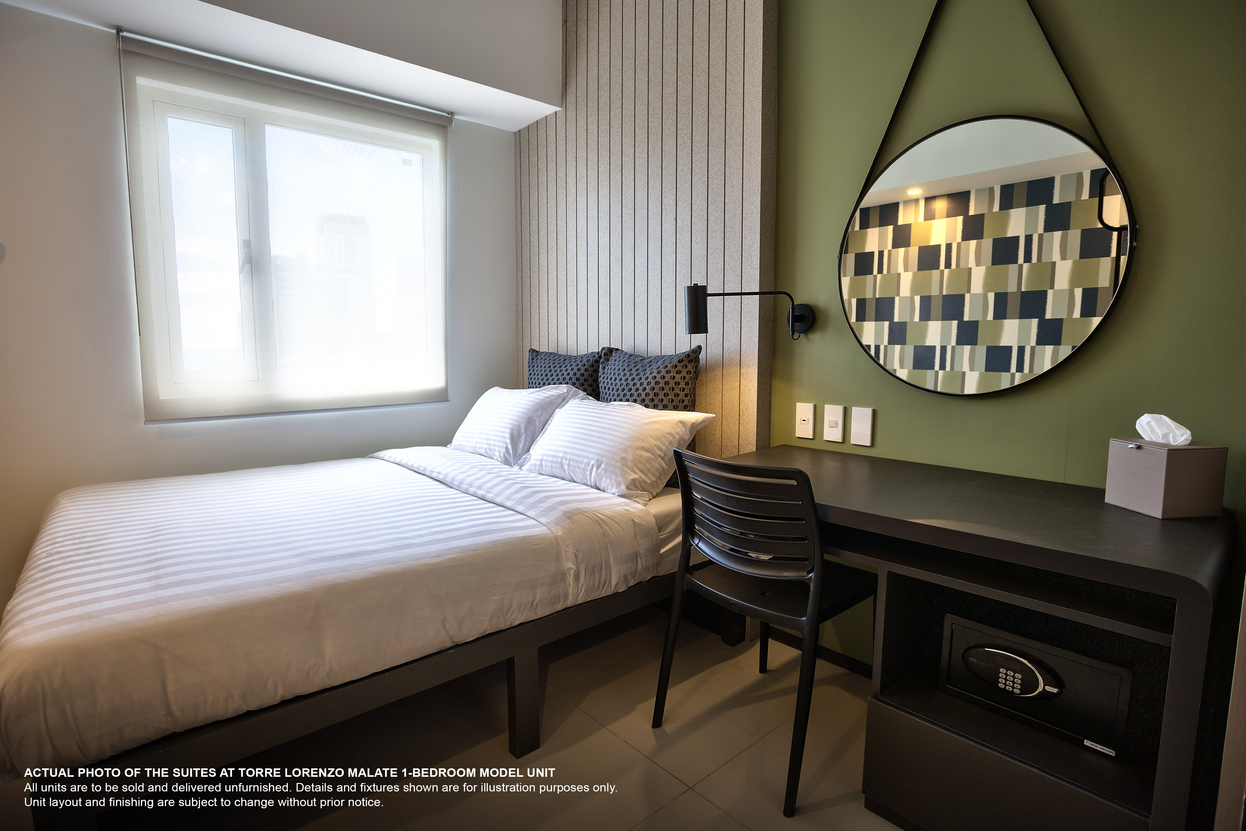 This is an actual photo of a one-bedroom unit at The Suites at Torre Lorenzo Malate.
Sage green is a trendy color in interior design. It oozes with style and elegance, and the deep shade provides a lot of personality in the room. Sage is usually paired with warm neutrals like ivory or ecru.
Cool gray
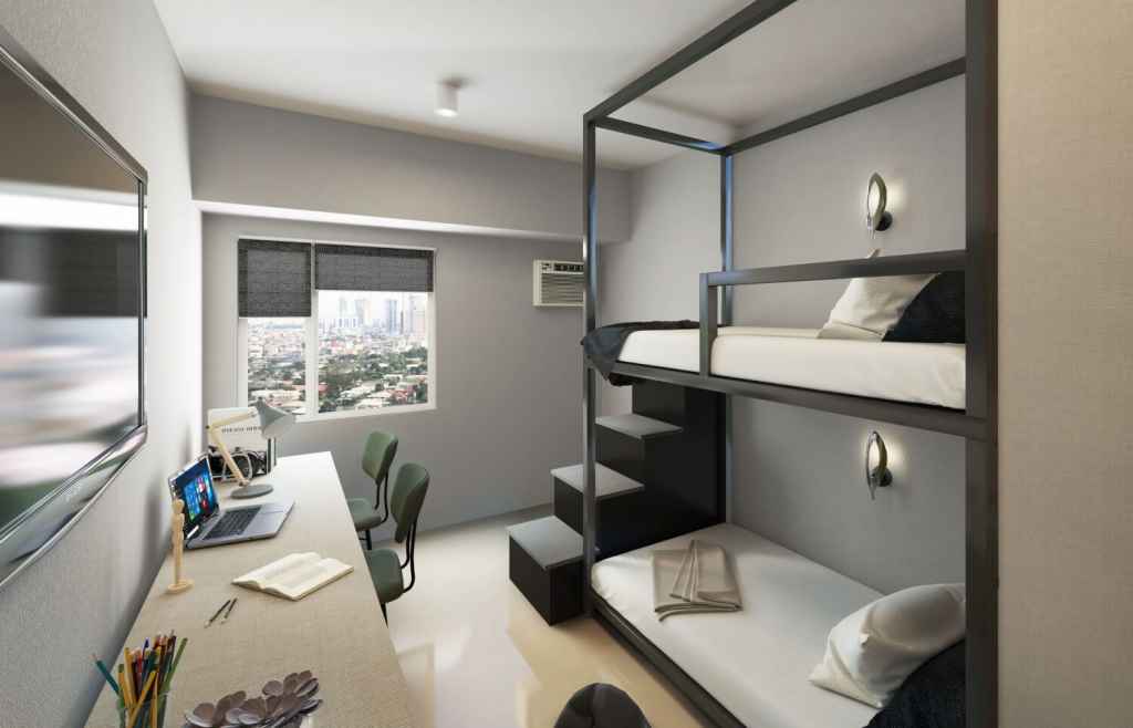
Actual photo of Torre Lorenzo Malate studio unit.
Cool colors like light gray or ivory promote relaxation and are soothing to the eyes. That’s why these are common choices for bedroom colors. It’s also a very versatile shade, so you can play around with different accent colors for your bedding and furniture.
Blush pink
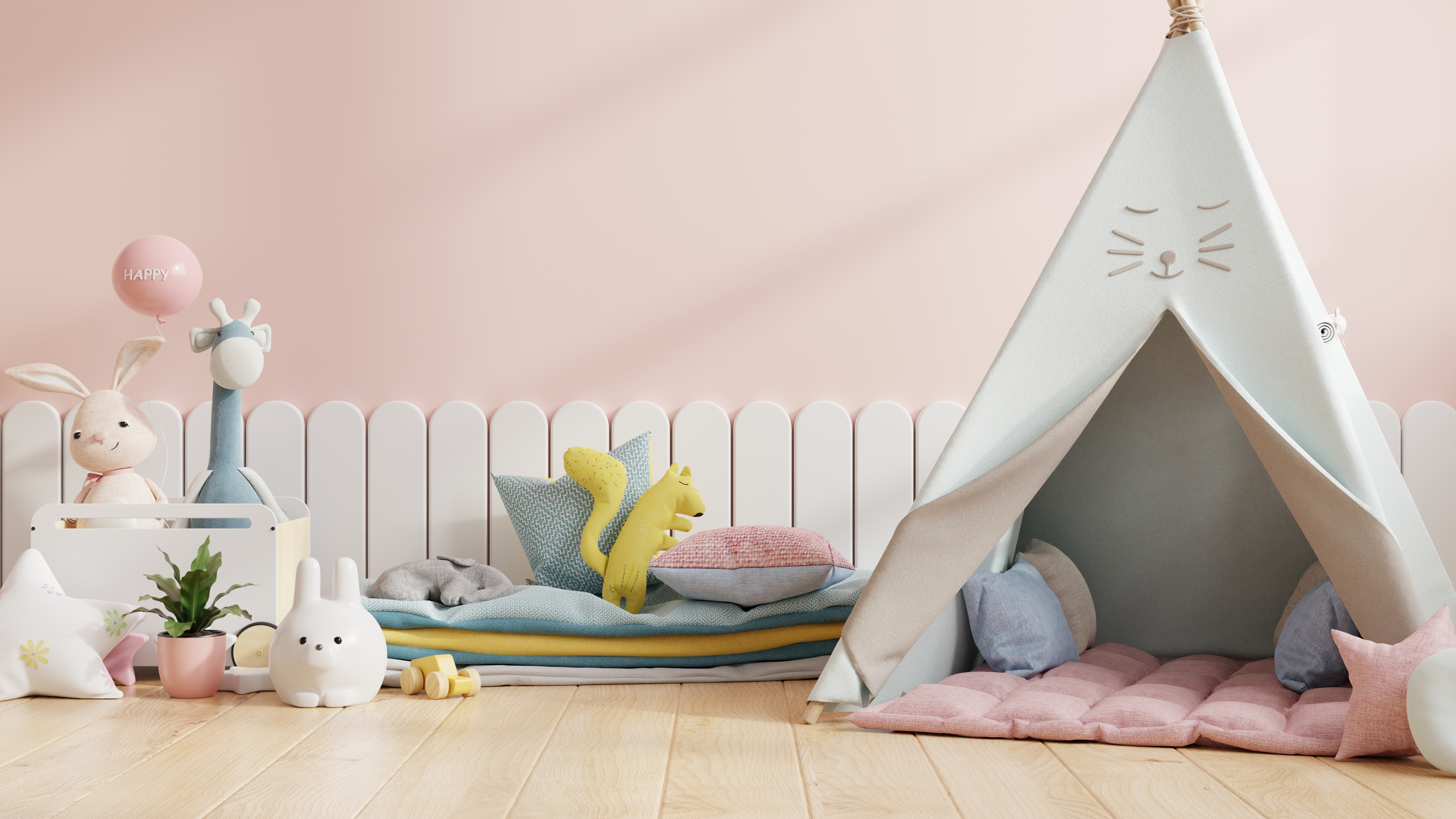 Image from: https://www.freepik.com/free-photo/mock-up-wall-children-s-room-with-chair-light-pink-color-wall-background-3d-rendering_15832352.htm
Blush pink gives a feminine glow to a bedroom. It’s subtle and not too loud, making it a good choice for a kid or teen bedroom. It works well with other pastel shades and whites.
5. Bathroom
Seafoam green
Seafoam green provides a clean and refreshing atmosphere for a bathroom. It evokes a beachy vibe and makes a small bathroom look bigger.
Taupe
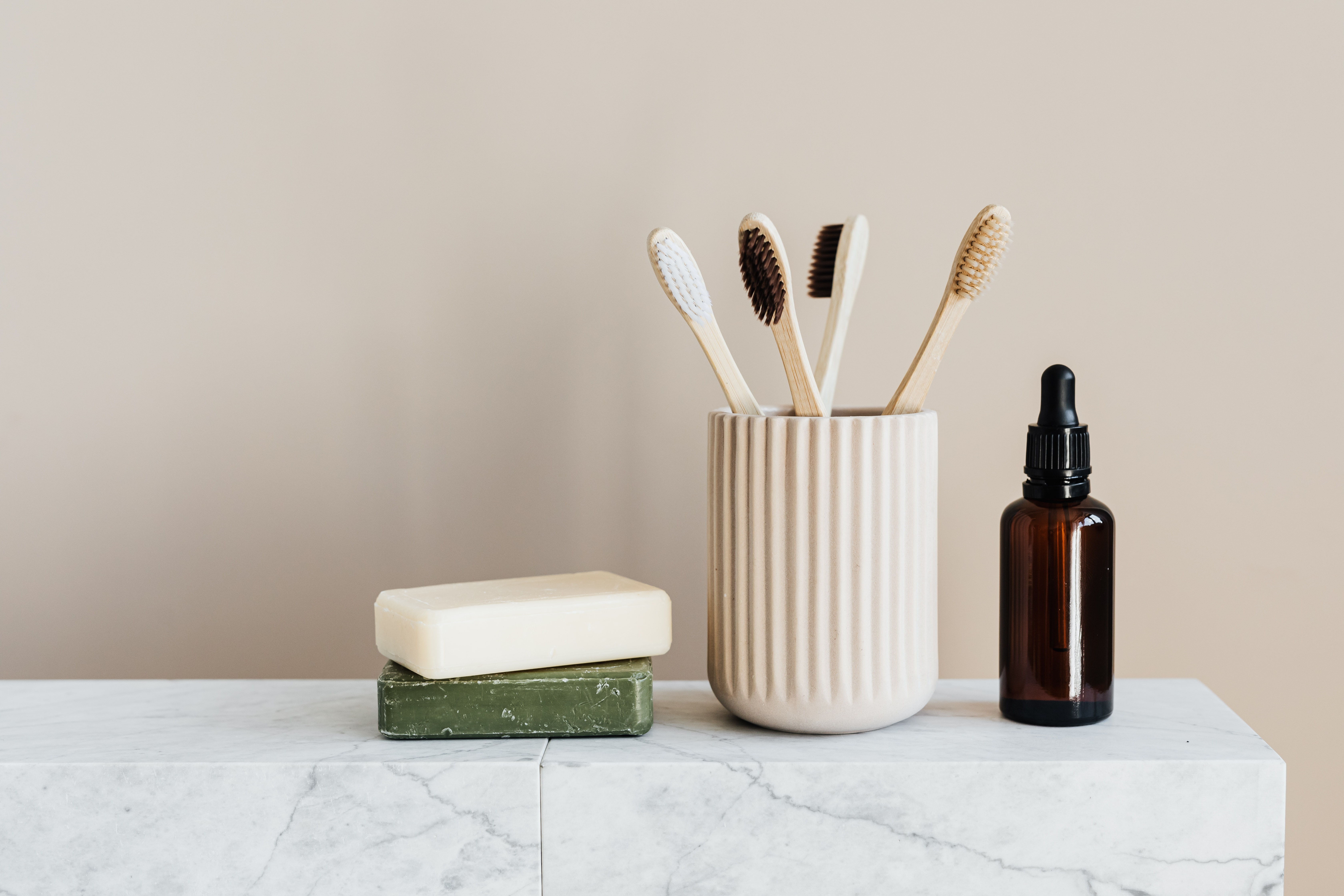 Image from: https://www.pexels.com/photo/4202926/
A neutral taupe shade provides an elegant and sophisticated look for your bathroom. It’s simple and sleek and pairs well with natural elements like bamboo or jute accessories.
Blue
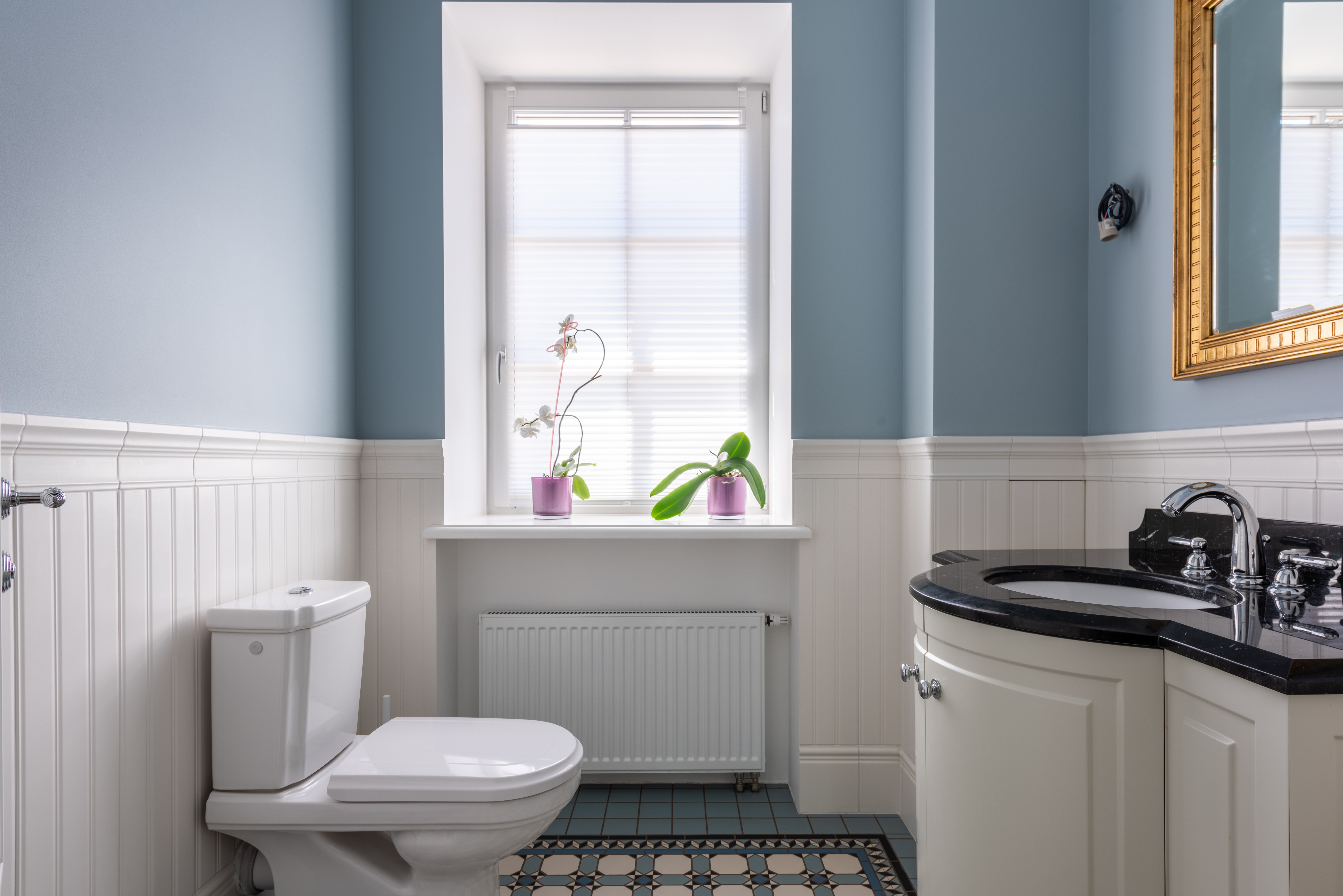 Image from: https://www.pexels.com/photo/interior-of-a-comfort-room-with-wood-panels-8143713/
The right shade of blue has a soothing and calming effect. Using nautical blue makes people feel like they’re in the ocean, relaxing while listening to the waves.
Choosing the right color scheme for your condo is a fun and engaging process. Especially nowadays, when the pandemic has forced people to stay at home more, it’s important to choose the best color scheme for your home as it can affect your overall well-being and outlook. Whether you’re for the bright and cheerful shades or the neutral tones, always remember that the best paint color for your home is the one that complements your personality.
For more tips on how to personalize and maximize your space, watch this video from award-wining interior design studio Atelier Almario. You can also catch some top interior design tips specifically for a condo in this video.
Torre Lorenzo Development Corporation (TLDC) is at the forefront of creating new opportunities in real estate. From pioneering premium university residences in the country, the company has grown its portfolio to include mixed-use and leisure developments in Manila, Quezon City, and Las Pinas, as well as in key emerging regions like South Luzon and Davao.
Quality and investment value are the hallmarks of TLDC’s premium residences, which have become distinct addresses in the metro’s university districts. In Davao, TLDC has partnered with international hospitality brand Dusit to bring you Dusit Thani Residence Davao, Dusitd2 Hotel, and Dusit Thani Lubi Plantation Resort - providing the most rewarding residential and leisure experiences in the region.
Sources:
“These Are the Hottest Colors for 2022, according to Interior Designers.” Apartment Therapy, Accessed Feb. 2022.
"7 Best Paint Colors for your Condo-Blog | LIVE Better by Minto." Accessed Feb. 2022.


